Introduction
Executive dashboards are not reports. They are decision systems. When designed correctly they help leadership move quickly reduce uncertainty and allocate resources with confidence. A dashboard that drives action must focus on clarity not decoration. CEOs and senior managers do not want complexity they want immediate answers.
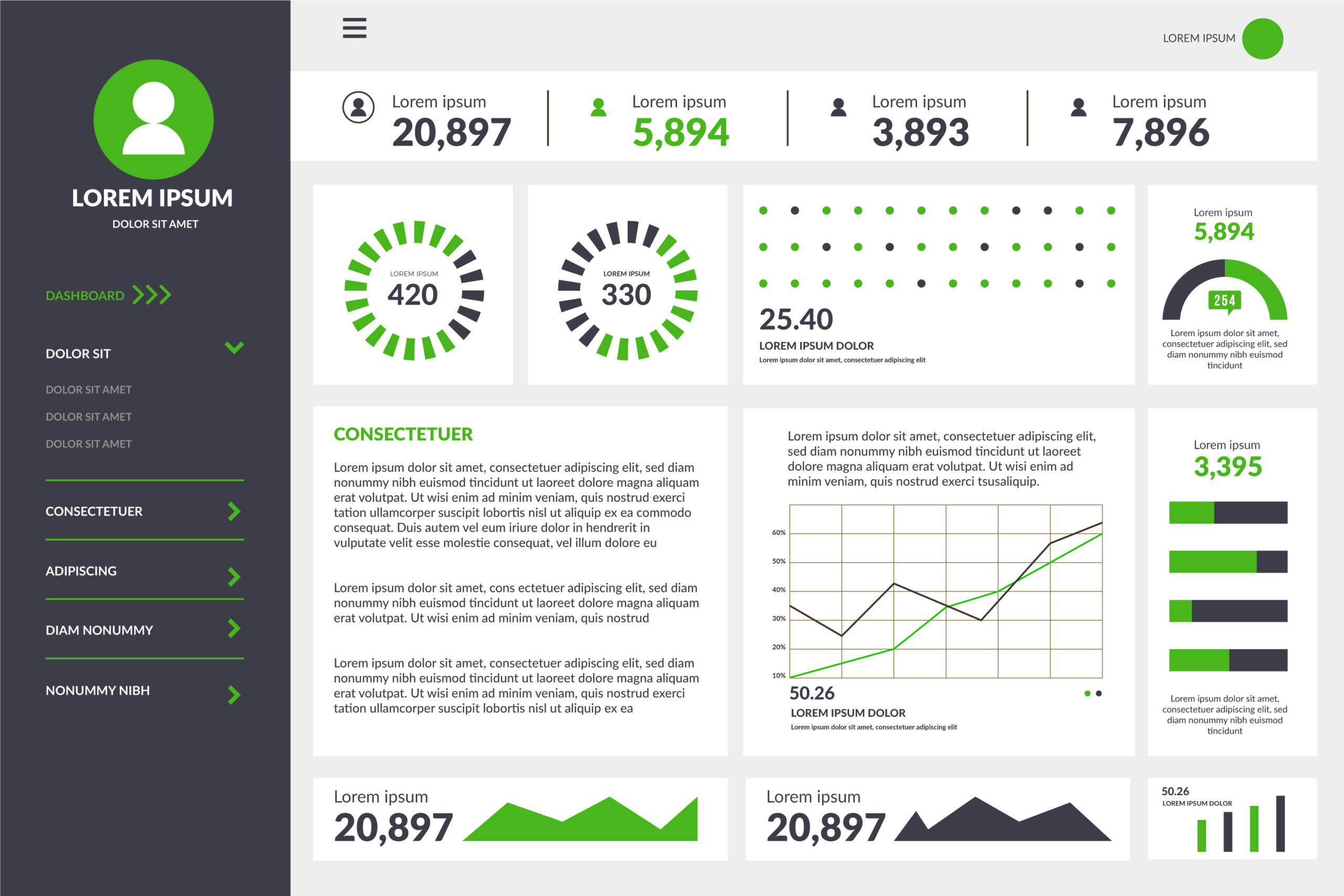
A successful dashboard does not try to show everything. It reveals the few metrics that matter the most to performance and long term goals.
What Makes an Executive Dashboard Different
Operational dashboards monitor operations. Analyst dashboards explore data. Executive dashboards guide high level strategy.
High performing dashboards share key traits
- Simple visual hierarchy
- Limited but meaningful KPIs
- Real time or near real time updates
- Context instead of raw numbers
Executives do not analyze they decide. Every metric must support a decision.
Core Components of Actionable Dashboards
1. Clear business objectives Define what leadership wants to achieve. Metrics must reflect those objectives.
2. Strategic KPIs Avoid vanity metrics. Prioritize revenue churn uptime project completion and productivity.
3. Visual simplicity Charts should be readable in seconds. Minimal labels and colors help the mind process faster.
4. Context Every metric must show trend comparison or forecast. A number by itself has no meaning.
5. Drill down capability Executives should be able to click into more detail without seeing clutter.
Mistakes That Destroy Dashboard Value
- Including every available metric
- Mixing operational and strategic KPIs
- Designing without talking to leadership
- Using flashy visualizations that distract
- Updating data weekly instead of daily or hourly
Designing With User Intent
Leadership questions drive dashboard design.
- What do we know today
- Are we winning or losing
- What needs our attention
- What is the trend
Metrics must answer these questions quietly without forcing extra analysis.
Recommended KPI Categories
- Financial performance
- Customer growth and retention
- Operational stability
- Market performance
- Team productivity
Every category should contain one or two KPIs at most.
Visualization Best Practices
- Use bar charts for comparisons
- Use line charts for trends
- Use scorecards for key metrics
- Avoid 3D and unnecessary shapes
The goal is clarity not entertainment.
Data Quality and Refresh Rates
Dashboards fail when their data becomes stale. Implement automatic refresh cycles and validation steps. If leaders cannot trust the numbers the system is useless.
Technology Choices
Use platforms capable of real time analytics such as Power BI Looker or Tableau. Centralizing metrics improves consistency and reduces reporting chaos.
Frequently Asked Questions
How often should executive dashboards be reviewed Weekly reviews are common but real time dashboards can be monitored daily.
Should executives see detailed data Not initially. Drill downs should exist but only for investigation.
Who should manage dashboard governance Assign ownership to a data lead who controls definitions and quality.
Conclusion
Executive dashboards win when they are simple fast and strategic. They do not ask executives to analyze they show them where to act. A well designed dashboard gives leadership a competitive advantage.
Call to Action
Build dashboards that drive real outcomes. Visit https://dataguruanalytics.org to explore analytics consulting and custom executive dashboard solutions.