Introduction
KPI dashboards are not decoration. They are executive weapons. A dashboard should answer one question: What action should we take right now?
Most organizations miss this. They create dashboards that show every metric, every filter and every trend but none that move decisions forward. When a dashboard is designed correctly, leaders understand performance at a glance and respond with confidence.
KPI dashboards influence decisions when three things align
- Clarity of purpose
- Accuracy of data
- Context for action
Without these, dashboards become visually impressive but strategically useless.
What Makes a KPI Dashboard Effective
A dashboard must be built for decisions, not for reporting. Reporting explains what happened. Decision dashboards explain what must happen next.
To influence decision making, KPI dashboards should
- Highlight a few critical indicators
- Present context, not clutter
- Trace insights back to business goals
- Visualize change over time
- Reveal anomalies without manual digging
Executives should never hunt for answers inside a dashboard. The answers should be delivered immediately.
Start with Purpose, Not Tools
Most dashboards fail because they begin with software, not strategy.
Teams pick the tool first, then search for metrics to fill it.
Instead, start with the question
What decision must this dashboard support?
Examples
- Should we adjust pricing this quarter
- Should we expand into new markets
- Is customer churn rising faster than acquisition
- Are production delays affecting profitability
When dashboards revolve around decisions, every chart has meaning.
The Core Structure of a Decision-Influencing Dashboard
Strong KPI dashboards follow a simple layout.
Top layer: Directional KPI
A single KPI that indicates business health, such as revenue growth or churn.
No interpretation required.
Middle layer: Drivers
Metrics that influence the top KPI, such as conversion, active accounts, inventory cycle, MRR expansion.
Bottom layer: Actions
Behavioral or operational metrics that leaders can adjust right now.
Anything that does not serve this hierarchy is noise.
Choose the Right KPIs
A KPI is not a metric.
A KPI is a metric tied to business performance.
Examples of KPIs
- Net Revenue Retention
- Customer Acquisition Cost
- Average Fulfillment Time
- First Contact Resolution
- Repeat Purchase Rate
The dashboard should reflect metrics the company can control.
If the company cannot influence it, it is not a KPI.
Data Quality Makes or Breaks Dashboards
Even the most beautifully designed visualization is useless if the data is unreliable.
Poor quality undermines trust and destroys adoption.
Executives must ensure
- Clear definitions for every KPI
- Consistent data sources
- No manually edited spreadsheets
- Automated validation of input streams
- Transparent lineage from source to dashboard
Quality and lineage support can be explored through
https://dataguruanalytics.org/data-quality-validation-solutions
Visual Design Principles for Executives
Design is not aesthetics. It is communication speed.
Dashboards should
- Use simple charts
- Avoid unnecessary colors
- Show trends, not single numbers
- Group KPIs by business function
- Place the most important metric in the top left
Executives should see direction instantly
Are we winning or losing
Are we accelerating or slowing down
Avoid the Dashboard Bloat Trap
Most dashboards collapse under weight.
Too many charts, unfiltered data and irrelevant widgets force leaders to interpret instead of decide.
Common dashboard mistakes
- Ten to twenty KPIs in one view
- Overlapping date ranges
- Combined operational and strategy metrics
- Every department inserting their own requests
Dashboards should look simple because someone did the hard work of prioritization.
Real World Example
A consumer subscription company was struggling with retention.
Executives looked at dozens of metrics but still could not locate the cause.
The dashboard was rebuilt around one KPI: Net Revenue Retention.
Supporting metrics
- Active users
- Session frequency
- Cancellation reason clustering
- Re engagement rate
Within weeks, leadership identified specific product friction points.
Retention improved because the dashboard created direction.
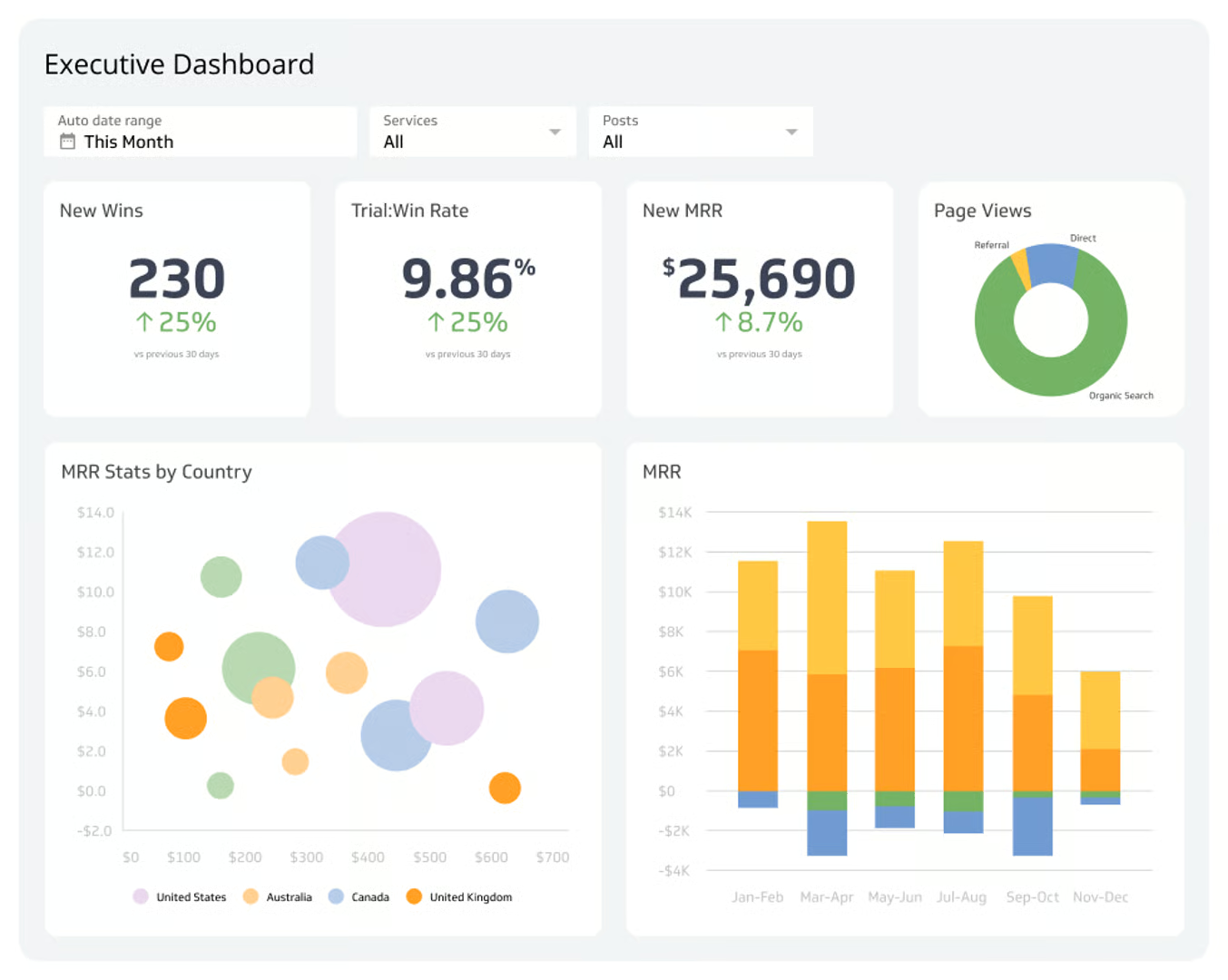
KPI Dashboards for the C-Suite
Executives are not analysts.
A CEO dashboard must show outcomes, not drilldowns.
A strong executive dashboard includes
- 3 to 5 strategic KPIs
- A forecast window
- A risk indicator
- A single strategic recommendation
If a dashboard does not tell leaders what to do next, it is not finished.
Operational vs Strategic Dashboards
Operational dashboards track execution.
Strategic dashboards track direction.
Operational dashboards
Daily orders
Support tickets
Inventory levels
Strategic dashboards
Revenue efficiency
Market penetration rate
Customer lifetime value
ROI by region
Mixing both kills clarity.
Frequently Asked Questions
Should dashboards include real time data
Only when the decision requires it. For revenue forecasting or churn analysis, daily or weekly is often better than real time.
Are KPIs the same for every business
No. KPIs must follow strategy, not industry templates.
How often should dashboards be updated
As often as leadership needs to make decisions. If metrics change weekly, update weekly. If hourly, update hourly.
Conclusion
KPI dashboards are not documents. They are decision engines.
They must be built around purpose, grounded in data quality and designed to deliver clarity, not decoration. When dashboards are created with intent, executive teams move faster, make fewer mistakes and direct resources with confidence.
Call to Action
Design data-driven dashboards that accelerate decisions. Begin at
https://dataguruanalytics.org/data-infrastructure-consulting and build visualization systems that deliver results, not confusion.